Well, this is happens when you get a kanji (or hanzi) tattoo without consulting someone who is knowledgeable and trustworthy. This is one of the worst kanji tattoos I've ever seen (and I've seen a lot of silly tattoos).
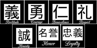
First, let's take a look at the image below: the seven virtues of the samurai, written in kanji. I've choose a common type of fonts - MS Gothic.
Now let's take a look at this photo: It's obvious that the tattoo is a completely lame.
Let's take a closer look at the ideograms tattooed on this dude's body:
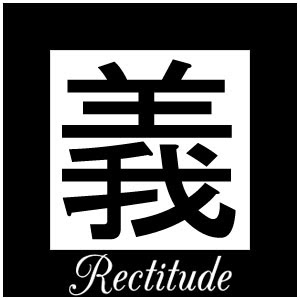
The first kanji, tattooed on the neck: two strokes are missing (the strokes from the top) and the ideogram has been splitted into two parts: 王 (king, monarch) and 我 (I, me). In the image below is a standard depiction of this kanji:
The second and the third kanji seem to be well written.
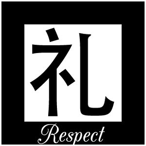
The 4th kanji is missing a stroke. In the image below is a standard depiction of this kanji:
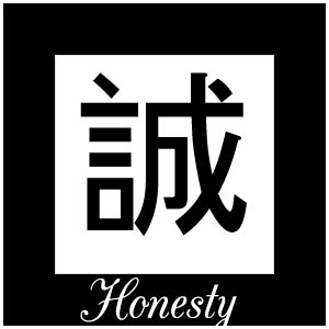
The 5th kanji is a total mess: a stroke is missing (in the upper right corner of the kanji) and the radical looks like an independent character. In the image below is a standard depiction of this kanji:
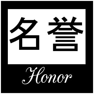
The 6th word is composed of two kanji characters (名 - distinguished / name / reputation and 誉 - glory / honor /praise / reputation). When a word is composed of two or more kanji, all the kanji must have the same size and must be written on the same line. In the image below is a standard depiction of this word:
As for the last word - Loyalty - this word can be written with one ideogram (like he did) or with two ideograms, like this: 忠義. Considering the awful drawing of the word above (honor), it was the a wise decision to choose the simpler variant :)

No comments:
Post a Comment